- Eric Crampton and Bryce Wilkinson write –
If a picture contains a thousand words, this column is going to run well over our normal word limit.
But the charts do say a lot, so we’ll let the charts do most of the talking. They help put this year’s budget in context. Draw what conclusions you like from them.
Prior to the election, Treasury put up its projections of what government spending would look like, as a fraction of GDP, in the Fiscal Strategy Model that accompanied the Pre-Election Fiscal Update.
Comparing those projections to those produced for the Budget Economic Fiscal Update provides one measure of the effect of the Budget.

Both the Budget and Pre-Election forecasts had government expenditures much higher, as a percentage of GDP, than had been the case prior to Covid. Being expressed as a percentage of GDP, they adjust for both population change and inflation.
Core government expenses, as a fraction of GDP, will be higher in 2025 than Treasury had forecast last year, but will be below the pre-election forecasts by 2028.
Former Reserve Bank economist and regular economics commentator Michael Reddell has described out-year forecasts – the projections further out in a forecast period – as ‘vaporware’. In other words, numbers unlikely to eventuate.
Treasury is required to accept government promises when setting the forecasts. So if you thought that Minister Robertson, Minister Willis, or both, were overly optimistic to stick to tighter budget allowances farther into the future, you can take those out-year forecasts with some scepticism.
But National has promised to reduce government’s share of overall economic activity only from 2028 onward.
Core Crown expenses include the cost of servicing government debt. Government debt expanded considerably over the Covid period and interest rates are now much higher.
So it can also be useful to look at core government spending excluding finance costs, again as fraction of economic activity.
Here we compare Treasury’s forecast tracks at the 2017 Pre-Election Fiscal Update, the 2019 Budget Economic Fiscal Update, the 2023 Pre-Election Fiscal Update, and the 2024 Budget Economic Fiscal Update.
The 2017 figures are the track expected from the policies set by the last National government. The 2019 figures reflect the “First Wellbeing Budget” – which few would have considered austere.

The track set prior to the 2023 election maintained core government spending, finance costs, well above pre-Covid levels relative to GDP effectively forever. The Covid shock was used to permanently increase government’s share of overall economic activity.
Budget 2024 projects that National will reduce core government spending, net of finance costs, to levels below Labour’s First Wellbeing Budget from 2031onward. By 2038, core government spending as a share of economic activity will be comparable to where it was when National left office in 2017.
But you will notice something else in that chart. There is a sharp difference in core crown expenses as fraction of GDP for 2016 and 2017 when we compare the 2017 forecast and the 2019 forecast. It would seem impossible, because 2016 spending had already happened. The number should not change. Unfortunately, initial GDP figures can often be well out from final figures, and those revisions affect the ratio of government spending to economic activity.
Government’s share of economic activity is a useful concept. But you have to be careful when looking at the numbers.
An alternative looks instead at inflation-adjusted core government spending, per capita, excluding the cost of servicing the debt. These figures do not see the same kinds of revisions as GDP.
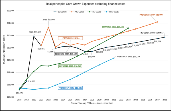
Here we see that the Great Wellbeing Budget added about $1600 in core government spending per person, in the projection for 2025, as compared to the spending track from the prior National government.
The Covid shock reflected in the 2023 Pre-election update added a further $1000 in per-capita spending. While core spending, adjusted for inflation, on a per-capita basis, came down from where it was at the heights of Covid, it remained well above the track set by the First Wellbeing Budget – at least until 2030.
Budget 2024 reduced real spending for 2024 by just under $400 per person. Spending remains and will remain higher than had been forecast under the Bill English National Government, but will drop below the First Wellbeing Budget’s track from 2027.
In other words, from now until 2027, Finance Minister Willis will be outspending what Finance Minister Robertson had promised in the First Wellbeing Budget, in real per-capita terms, net of debt servicing costs.
If you think that Minister Robertson’s figures undercooked what actual expenditure would be in the out-years, then spending now might already be below it; if you think that Finance Minister Willis is overly optimistic about sticking to tight spending tracks over the next few years, then it may take longer to reach the figures Minister Robertson had promised.
And if you think the projections for the longer term for both are more than a little cooked, then you might support the creation of an independent fiscal institution, which would report to Parliament with more realistic projections of spending tracks. An agency that is not required to believe that hard-to-end programmes will indeed see zero budgets after a fiscal cliff could be helpful.
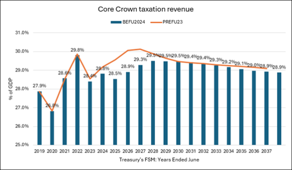
Treasury expects government to collect far less revenue as a fraction of GDP than had been expected prior to the election, but that the effect washes out by 2030.
This is in part due to lower expected economic growth. Core tax revenue as a fraction of economic activity is also lower for the year ended June 2023, which could not be due to the 2023 election.
The decline in tax revenue combined with only a slow projected decline in spending results in a higher track for expected net government debt through 2032 than had been expected prior to the election, whether measured in dollar terms or as fraction of GDP.
While other countries have much higher debt to GDP ratios, New Zealand risky place. Treasury and the major political parties have traditionally viewed it as prudent to keep a substantial buffer against future emergencies. The debt ratios are not as bad as had been forecast in 2020, when we were seriously concerned. But they still need to be brought down.

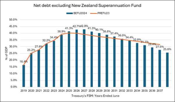
The Superannuation Fund is here excluded because, when it is included, projections become sensitive to expectations of stock market performance.
As always, remember that both debt tracks depend on how seriously you take the projections for spending further out in the forecast period. It is easier to believe the figures through 2026 than the projections farther out. And, unfortunately, those are the years with rising net debt.
These are the numbers. We all bring our own interpretation to them. Government’s share of overall economic activity will remain much higher than it had been prior to Covid. If you believe the longer-term projections, that may change in the 2030s. If you do not, then Covid has meant a permanent ratcheting-up of government’s share of economic activity.
We do not particularly like the overall picture.
This article by Eric Crampton and Bryce Wilkinson was first published at The New Zealand Initiative.
